Silver bullet
로지스틱 회귀 (sigmoid function & Cutoff, Cross-entropy & Softmax, Accuracy & Recall & Precision, ROC Curve & AUC) 본문
로지스틱 회귀 (sigmoid function & Cutoff, Cross-entropy & Softmax, Accuracy & Recall & Precision, ROC Curve & AUC)
밀크쌀과자 2024. 7. 9. 17:101. Logistic Regression (로지스틱 회귀)
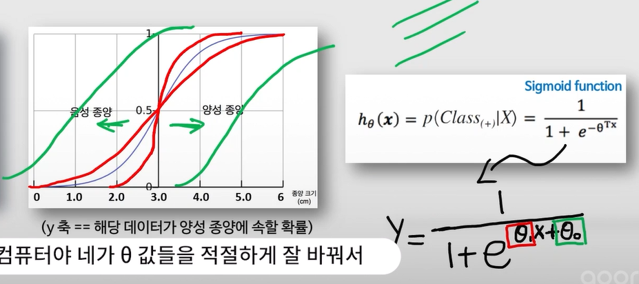
- 이진 분류 (binary classification) 문제를 해결하기 위한 모델
- 변형된 모델로 다항 로지스틱 회귀(k-class)와 서수 로지스틱 회귀(k-class & ordinal)도 존재
ex) 스팸 메일 분류, 질병 양성 / 음성 분류, 신용카드 거래에서 정상 거래 및 이상 거래 분류 등
- Sigmoid function을 이용하여 기본적으로 특정 Input data가 양성 class에 속할 확률을 계산
- Sigmoid function의 정확한 y값을 받아 양성일 확률을 예측하거나, 특정 cutoff(threshold or boundary)를 넘는 경우 양성, 그 외에는 음성으로 예측할 수 있음
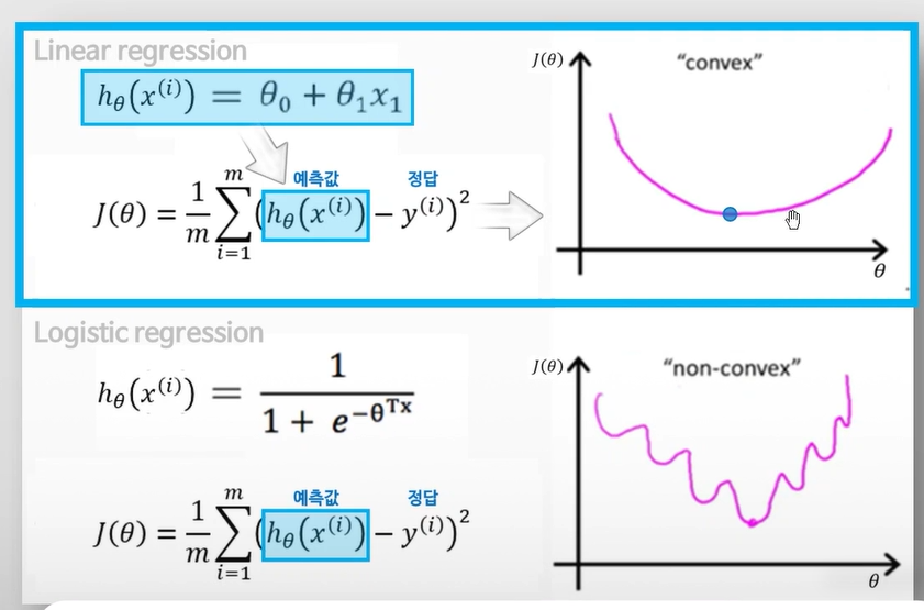
- 성능지표로 MSE가 아닌 분류를 위한 Cost function인 Cross-entropy를 활용
- 예측값의 분포와 실제값의 분포를 비교하여 그 차이를 Cost로!
- predict_proba() 함수로 정확한 y값 확인 가능
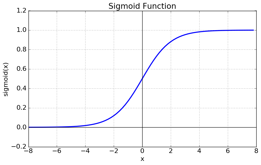
- sigmoid cutoff default = 0.5
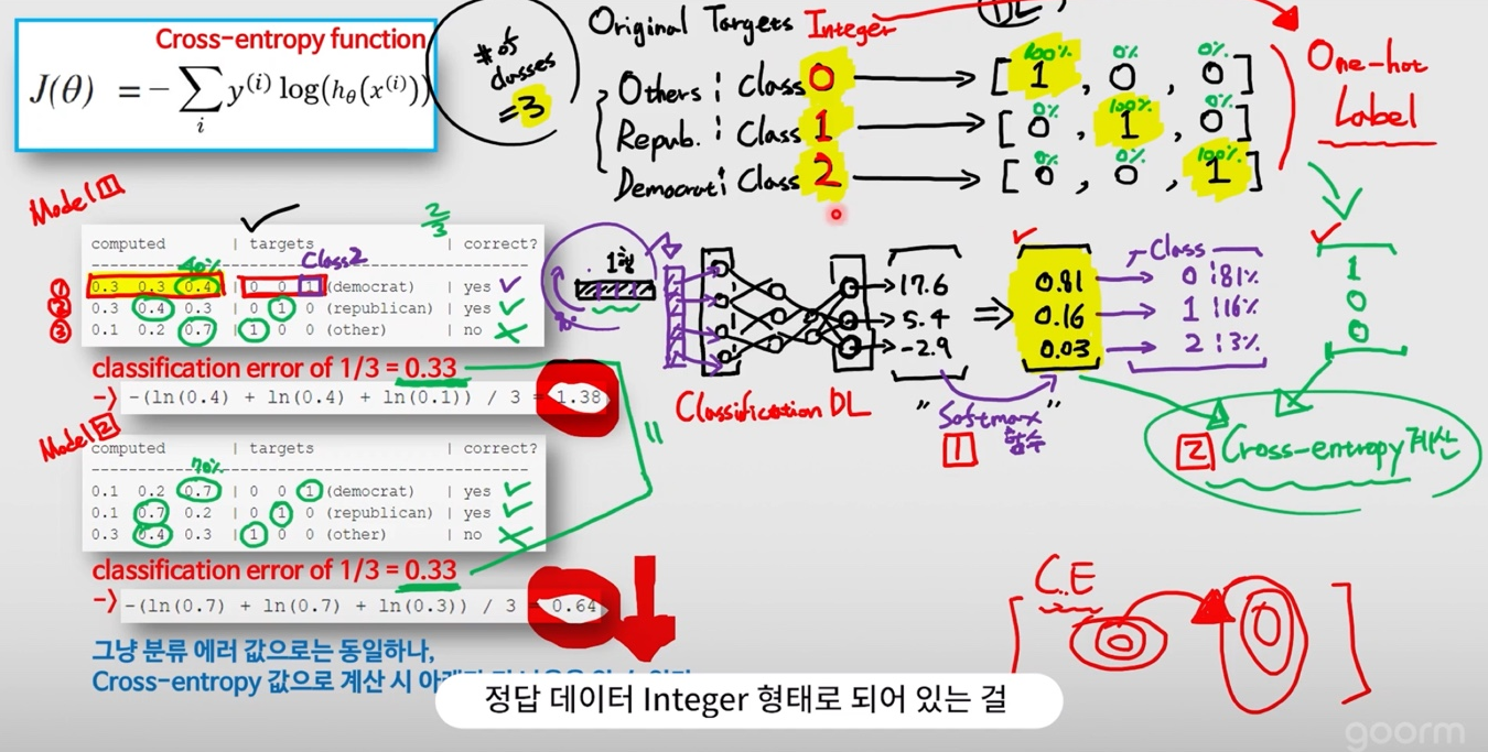
Cross-entropy : 분류 문제에서 가장 대표적인 Cost function
softmax함수를 적용한 후, 정답 라벨과 비교
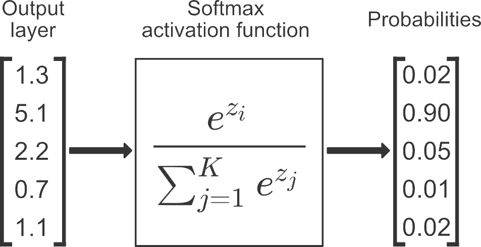
2. Softmax Algorithm(소프트맥스 알고리즘)
- 다중 클래스 분류 문제를 위한 알고리즘 (일종의 함수)
- model의 output에 해당하는 logit(score)을 각 클래스에 소속될 확률에 해당하는 값들의 벡터로 변환해준다.
- Logistic regression를 변형/발전시킨 방법으로, binary class 문제를 벗어나 multiple class 문제로 일반화시켜 적용할 수 있다.
3. LogisticRegression_sklearn
1-1. (미국 보스턴의 주택 가격) 데이터 읽어들이기 & Binary label 만들어주기
import numpy as np
import pandas as pd
import matplotlib.pyplot as plt

from sklearn import datasets, model_selection, linear_model
from sklearn.metrics import mean_squared_error

df_data = pd.read_excel('boston_house_data.xlsx', index_col=0)
df_data.head()

df_target = pd.read_excel('boston_house_target.xlsx', index_col=0)
df_target.head()

# 집값의 평균값이 얼마일까요?
mean_price = df_target[0].mean()
mean_price

df_target['Label'] = df_target[0].apply(lambda x: 1 if x > mean_price else 0 ) # 새로운 함수를 '적용'해주려면?
df_target.head()
1-2. Dataframe 을 Numpy array (배열, 행렬)로 바꿔주기
boston_data = np.array(df_data)
boston_target = np.array(df_target['Label'])
2. Feature 선택하기
# Use only one feature

boston_X = boston_data[:,(5, 12)] # 주택당 방 수 & 인구 중 하위 계층 비율
boston_X

boston_Y = boston_target
3. Training & Test set 으로 나눠주기
from sklearn import model_selection

x_train, x_test, y_train, y_test = model_selection.train_test_split(boston_X, boston_Y, test_size=0.3, random_state=0)
4. 비어있는 모델 객체 만들기
model = linear_model.LogisticRegression() # 로지스틱회귀
5. 모델 객체 학습시키기 (on training data)
# Train the model using the training sets

model.fit(x_train, y_train)
6. 학습이 끝난 모델 테스트하기 (on test data)
# 양성/음성 확률을 확인하려면?

# plot roc curve for test set
pred_test = model.predict_proba(x_test) # Predict 'probability'
pred_test

from sklearn.metrics import accuracy_score # accuracy
# 모델 분류의 정확도 (분류 모델만 사용 가능)
print('Accuracy: ', accuracy_score(model.predict(x_test), y_test))
Accuracy: 0.8223684210526315
7. 모델 시각화
from sklearn.metrics import roc_curve, auc

fpr, tpr, _ = roc_curve(y_true=y_test, y_score=pred_test[:,1]) # real y & predicted y (based on "Sepal width")
roc_auc = auc(fpr, tpr) # AUC 면적의 값 (수치)
roc_auc

fpr # 꺾이는 지점의 x좌표
tpr # 꺾이는 지점의 y좌표

plt.figure(figsize=(10, 10))

plt.plot(fpr, tpr, color='darkorange', lw=2, label='ROC curve (area = %0.2f)' % roc_auc)
plt.plot([0, 1], [0, 1], color='navy', lw=2, linestyle='--')

plt.xlim([0.0, 1.0])
plt.ylim([0.0, 1.05])
plt.xlabel('False Positive Rate')
plt.ylabel('True Positive Rate')
plt.legend(loc="lower right")
plt.title("ROC curve")

plt.show()
* roc_curve 그릴때는 y_score 값으로 predict_proba [:, 1] (class1 확률)를 넣어서 predict y값을 넣어줘야 한다.
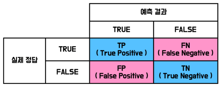
Accuracy = (TP + TN) / (TP + TN + FP + FN)
정확성 = 참긍정 + 참부정 / 총 예시 수
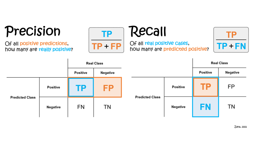
Recall : 암 환자 분류 (실제 참인 것들 중 참이라고 분류한 것)
Precision : 스팸 메일 분 (참이라고 예측한 것들 중 진짜 참인 것)
F1-Score : Recall과 Precision을 동시에 고려하는 (R & P 조화평균)
F-beta score : Recall과 Precision 중 중요한 것에 가중치를 조금 더 두어서 계산해보는 것
진양성율, 위양성율

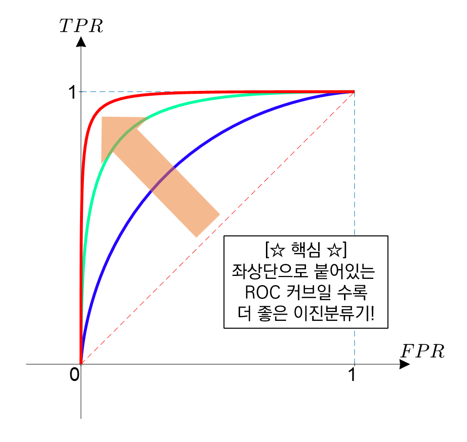
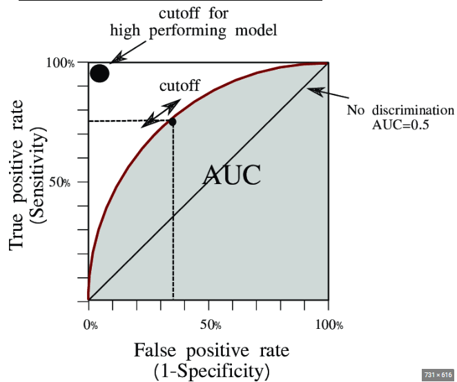
AUC = Area Under the ROC Curve
- measure the quality of classifier
- AUC = 0.5 : random classifier
- AUC = 1 : perfect classifier
- 정말 좋은 모델은 AUC가 0.9 이상이며, 보통 AUC가 0.7 후반 이상이면 어느 정도 실용적으로 활용 가능한 모델이라고 할 수 있다.
전체 코드
import numpy as np
import pandas as pd
import matplotlib.pyplot as plt
from sklearn import datasets, model_selection, linear_model
from sklearn.metrics import mean_squared_error, accuracy_score, roc_curve, auc

# 1. Prepare the data (array!)
df_data = pd.read_excel('boston_house_data.xlsx', index_col=0)
df_target = pd.read_excel('boston_house_target.xlsx')
df_target['Label'] = df_target[0].apply(lambda x: 1 if x > df_target[0].mean() else 0 )
boston_data = np.array(df_data)
boston_target = np.array(df_target['Label'])

# 2. Feature selection
boston_X = boston_data[:, 5:13] # 주택당 방 수 & 인구 중 하위 계층 비율
boston_Y = boston_target

# 3. Train/Test split
x_train, x_test, y_train, y_test = model_selection.train_test_split(boston_X, boston_Y, test_size=0.3, random_state=0)

# 4. Create model object
model = linear_model.LogisticRegression()

# 5. Train the model
model.fit(x_train, y_train)

# 6. Test the model
print('Accuracy: ', accuracy_score(model.predict(x_test), y_test))

# 7. Visualize the model
pred_test = model.predict_proba(x_test) # Predict 'probability'
fpr, tpr, _ = roc_curve(y_true=y_test, y_score=pred_test[:,1]) # real y & predicted y (based on "Sepal width")
roc_auc = auc(fpr, tpr) # AUC 면적의 값 (수치)

plt.figure(figsize=(10, 10))
plt.plot(fpr, tpr, color='darkorange', lw=2, label='ROC curve (area = %0.2f)' % roc_auc)
plt.plot([0, 1], [0, 1], color='navy', lw=2, linestyle='--')
plt.xlim([0.0, 1.0])
plt.ylim([0.0, 1.05])
plt.xlabel('False Positive Rate')
plt.ylabel('True Positive Rate')
plt.legend(loc="lower right")
plt.title("ROC curve")
plt.show()
'AI > AI' 카테고리의 다른 글
| SVM - Soft-margin Kernelized SVM / StandardScaler, HPO & GridSearchCV (0) | 2024.07.10 |
|---|---|
| Adaboost & Gradient Boosting & XGBoost / Gradient Boosting regression & classification 실습 코드 (0) | 2024.07.10 |
| 선형 회귀 실습(Scikit-learn & One-hot encoding) (0) | 2024.07.08 |
| 비용함수와 경사하강법 (Cost function & MSE) (0) | 2024.07.08 |
| 머신러닝 기초 (capacity, overfitting, K-Fold cross validation) (0) | 2024.07.08 |


